Do you want to improve conversion rates for your online payment forms? Knowing the top complaints customers have about forms will help you to avoid the same problems.
In this article, we’ll look at some of the most common complaints about payment forms and demonstrate ways you can avoid them.
Create Your Online Payment Form Now
What Are the Most Common Customer Complaints About Forms?
If you want to get people to make a payment, form abandonment is the #1 problem you’ll need to solve.
Online form statistics show that 76.9% of shoppers have abandoned a payment form after starting to fill it out.
The most common reasons are:
- Concerns about payment security
- Forms that are too long or too complicated
- Forms that force them to create an account before they can pay.
To help with this, WPForms has a form abandonment addon that captures data from forms that are started but not submitted.
That means you can capture the details that have been filled out, even if your visitor hasn’t clicked the Submit button on the form.
WPForms also lets you drag and drop payment fields onto any forms. You don’t need to copy and paste any code, and you can use services like:
To add a payment field to a form, all you need to do is drag and drop it:
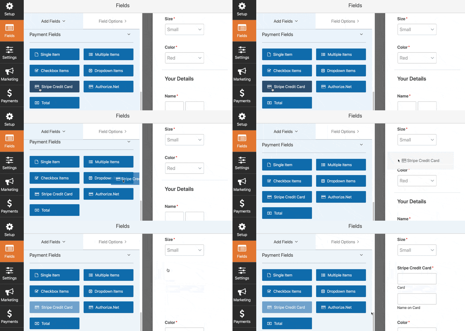
If you know the most common complaints about payment forms, you can easily fix them. That will help to improve your conversions and make it less likely that your forms will be abandoned.
Let’s move on to look at the top complaints about forms and ways that WPForms can help you to solve these issues.
7 Reasons Customers Hate Online Payment Forms
It’s estimated that 81% of people have abandoned a form after starting to fill it out.
We picked out the 7 most important reasons:
- Lack of Trust
- Unclear Pricing
- Making Customers Register
- Forms That Are Too Long
- Unclear Shipping Times
- Limited Payment Methods
- Confusing Errors
Let’s look at ways to solve each of these problems.
1. Lack of Trust
If a customer doesn’t trust your website, they won’t be comfortable giving you their payment details.
In fact, 12% of people will abandon a form if there are no trust badges. Nobody wants to be at risk of fraud or identity theft.
Before taking payment through a form, you need to reassure your customer that you have the right security in place.
How to Increase Trust in Your Payment Forms
First, you’ll want to make sure that your WordPress forms are secure.
Be sure to get a free SSL certificate for your website so that your visitors see the padlock in the URL bar.

Next, read this guide on how to add the McAfee Secure Seal to your WordPress site. Adding this trust badge is a free and simple way to show that your site is secure.
Finally, you can remind your customers that you’re PCI compliant, which means that your payment processing is secure.
That’s because WPForms sends the customer’s payment details directly to the payment processor. No card details are stored on your server.
If you want to encourage conversions, think about adding social proof to your forms. When you put a testimonial or a review on your form, you’re showing the customer that real customers like them have already placed orders.
2. Unclear Pricing
What happens when you fill out an order form and the price changes at the end?
Yep. You quit and look somewhere else.
Once you show your customer a price, it’s really important to stick to your promise and show the price clearly when you take a payment.
How to Show Prices on Your Payment Forms
WPForms lets you show the item price right next to the item on your online payment form.
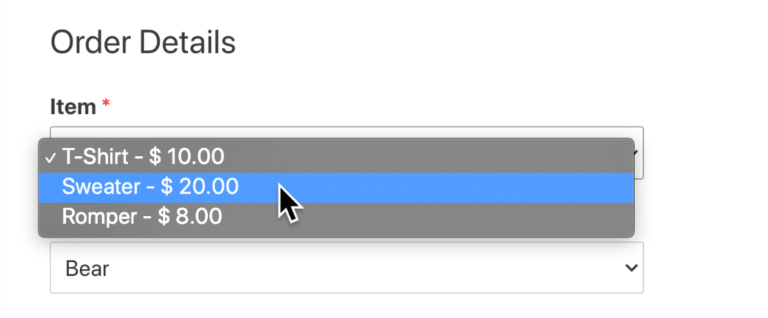
That way, your customer can see exactly what they’ll be billed for.
You can display prices easily using WPForms. When you add an item field, just check the Show price after item labels checkbox.
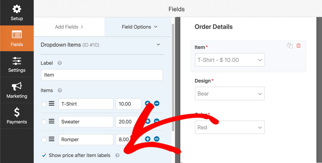
It’s also good practice to also show the customer the amount they’ll be charged before they hit the payment button.
You can automatically show the total in WPForms using the Total field:
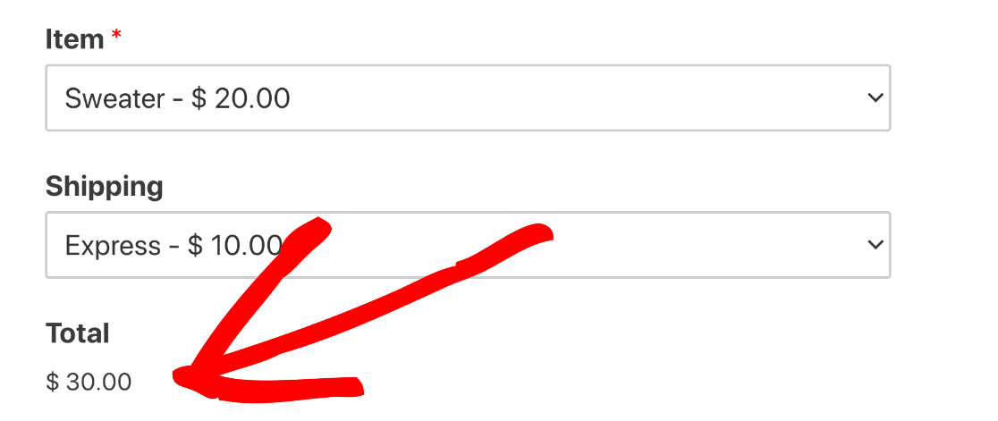
If you’d like to learn how to use this feature, read our guide on how to add product options and calculate the total.
3. Making Customers Register
Do you really want to fill out a 3-page registration form just to order a sweater?
Nope. And neither do your customers.
In our research, we found that 23% of customers will abandon their order if you force them to register.
To increase payment form conversions, it makes sense to remove that barrier.
How to Take Orders Without an Account
Online payment forms are a great way to remove this pain point because you don’t need an account.
You can make a simple order form that’s much easier to use than a full eCommerce checkout:
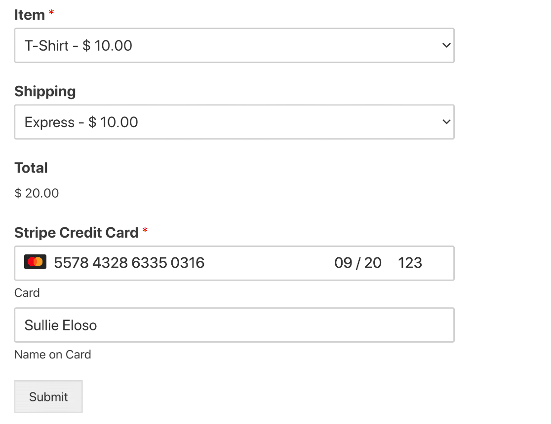
We created this form in a few minutes using the T-Shirt Order Form template. You can quickly customize the templates in WPForms and remove any fields that you don’t need.
WPForms comes with 100+ form templates that you can use to create forms quickly.
4. Forms That Are Too Long
In our online form statistics, we noticed an interesting fact from Quicksprout: limiting form fields to just 3 can slash abandonment rates.
Long forms scare people off because:
- Forms with too many fields take a long time to fill out
- If you have tons of fields, you’re probably asking for information that the customer doesn’t want to share.
It’s not practical for everyone to reduce online payment forms to just 3 fields. But WPForms has 3 smart features to help you out.
How to Make Short Online Payment Forms
First, remove all of the fields that don’t need to be there. You can quickly click the trash can icon next to a field to delete it.
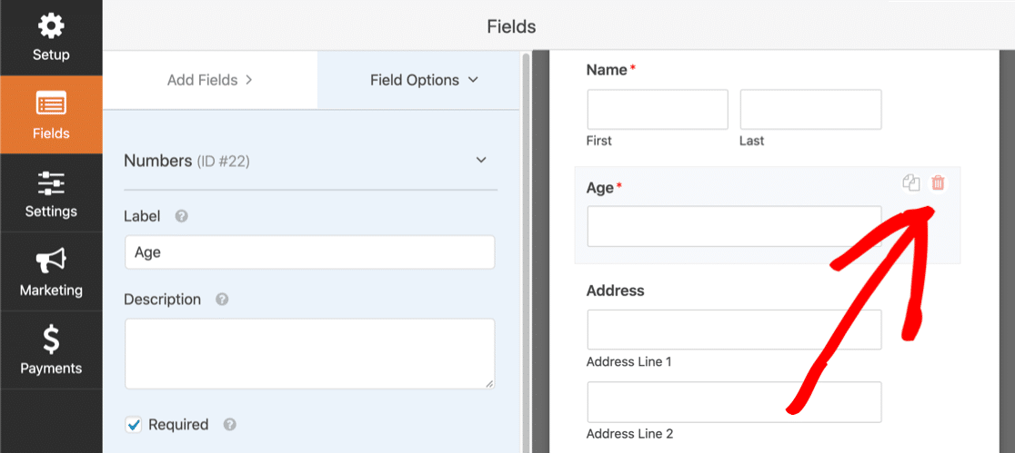
Next, see if any fields can be made optional.
As an example, 37% of people will abandon a form that requires a phone number. And making the phone field optional has been seen to double conversion rates.
In the form builder, you can make the phone field optional by unticking the Required checkbox:
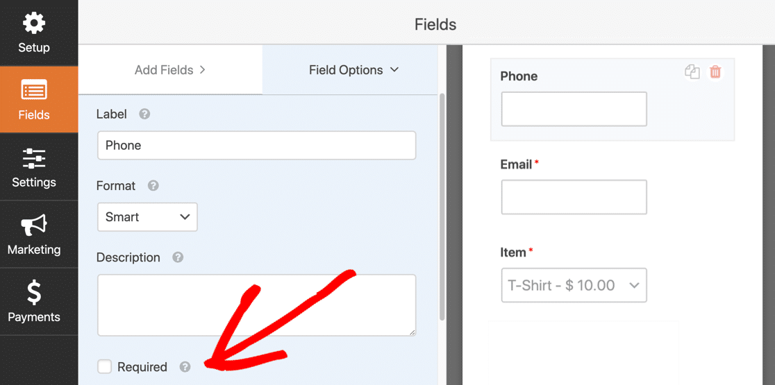
If you really need to have lots of fields, you can make a multi-step form. Quicksprout research suggests that multi-step forms can lead to a 300% increase in conversions.
In WPForms, you can easily create a multi-step form by dragging page breaks onto the form builder window:
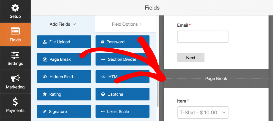
Now WPForms will display a progress bar at the top of your form:
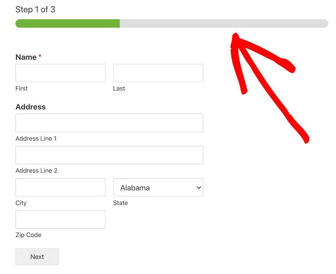
This simple trick makes long forms easy to fill out, and less intimidating.
5. Unclear Shipping Times
Big stores like Amazon have trained us to expect clear timelines for shipping.
If you don’t provide this information clearly on your website, your customers might back out of the purchase.
Failing to set expectations for delivery can be a huge barrier to conversions.
How to Show Delivery Times on a Form
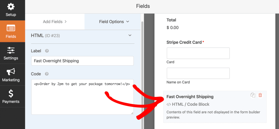
WPForms lets you add extra text anywhere on a form using the HTML field.
You can use this to display shipping information right on the form.
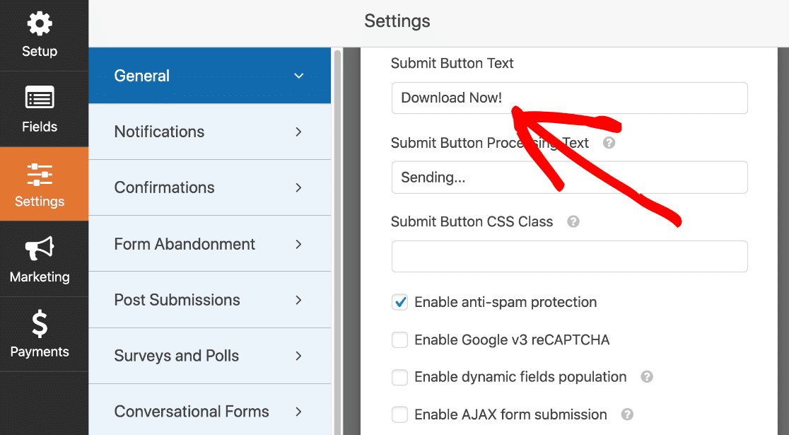
The text on your Submit button can also make a difference to conversions. It’s easy to change this in WPForms in the form Settings screen.
For example, you might want to change the Submit button to say Download Now if you’re selling digital downloads:
6. Limited Payment Methods
Most customers have a payment method in mind when they place an order.
If you limit your payment form to just one payment method, you might lose customers who wanted more choice.
How to Add Multiple Payment Methods to Your Forms
Are you thinking about Stripe vs PayPal? With WPForms, you can use both on one form.
You’ll just need to add a dropdown so that the customer can choose a payment method.
You can then show or hide the payment fields based on their choice:
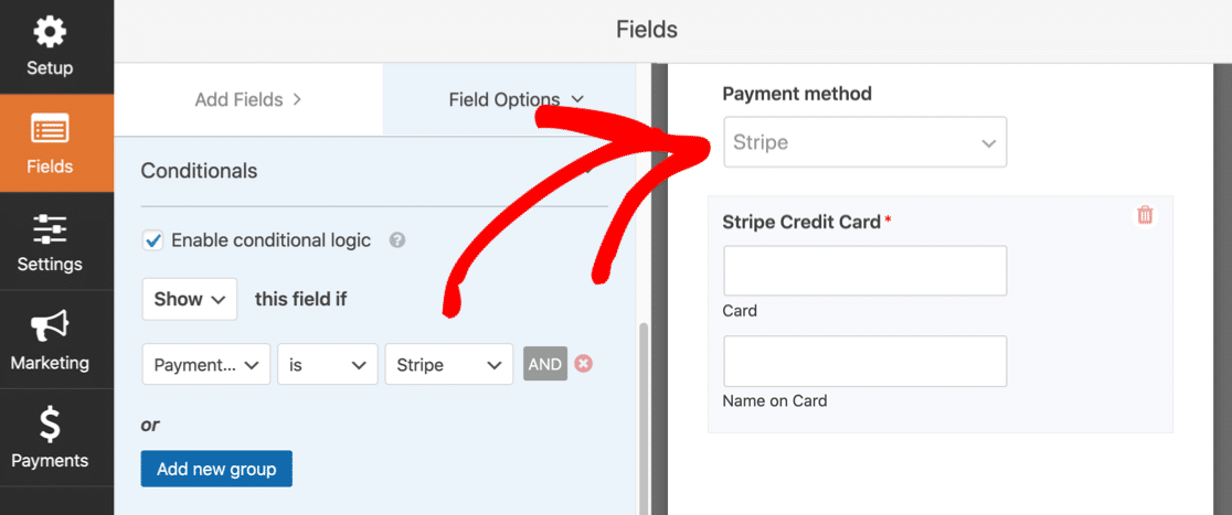
If you’d like to know more, check out this guide on using conditional logic to add multiple payment methods.
7. Confusing Errors
Form field validation is a great way to check that your form is filled out correctly.
But if it goes wrong, your customer will get stuck.
There are 3 things that can cause confusing errors:
- Your form might have a required field that doesn’t apply to every customer
- The form field validation might be asking for something in the wrong format
- You have so much validation that your customer finds it frustrating to get everything right.
It’s important to test your payment forms properly to make sure your validation works and isn’t excessive.
How to Test Your Online Payment Forms
WPForms shows many validation messages right under the form field. It’s super easy for the customer to see what’s gone wrong and how to fix it.
For example, if you enter your email address in the wrong format, WPForms tells you right away:
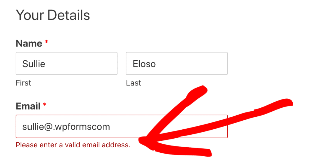
This helps the customer to fix the problem before they submit the form. That will help to avoid form abandonment.
You can create input masks for your form if you need to validate other fields.
Finally, it’s also a good idea to test payment forms using sandbox or test mode.
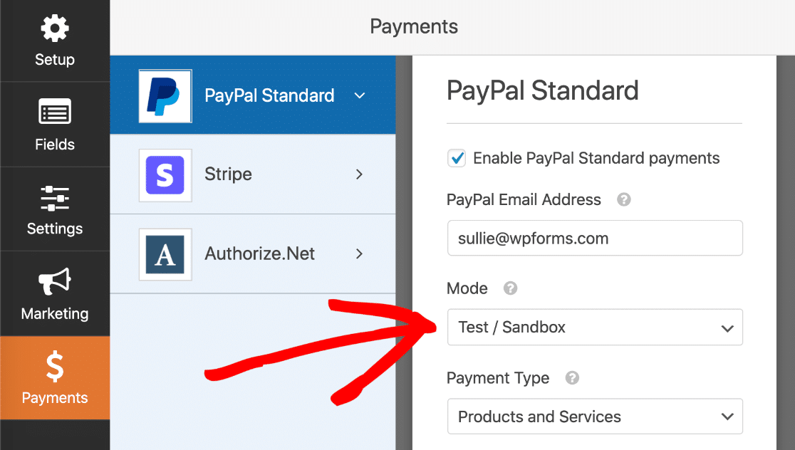
This guide shows you how to set up a sandbox account on PayPal and connect it to WPForms. You can also read our guide on how to test your form before launching it.
Create Your Online Payment Form Now
Next Step: Track Your Form Abandonment Rates
Now you’ve optimized your form, you’ll want to track form abandonment in Google Analytics. This will help you to spot pain points in your forms and see how well they are converting.
Ready to build better online payment forms? Get started today with the easiest WordPress form builder plugin. WPForms Pro includes payment addons for Stripe, PayPal, and more, and offers a 14-day money-back guarantee.
If this article helped you out, please follow us on Facebook and Twitter for more free WordPress tutorials and guides.
The post 7 Reasons Customers Hate Online Payment Forms (& How to Fix) appeared first on WPForms.
source https://wpforms.com/complaints-about-online-payment-forms/

